BEANS & BREW
How It Started
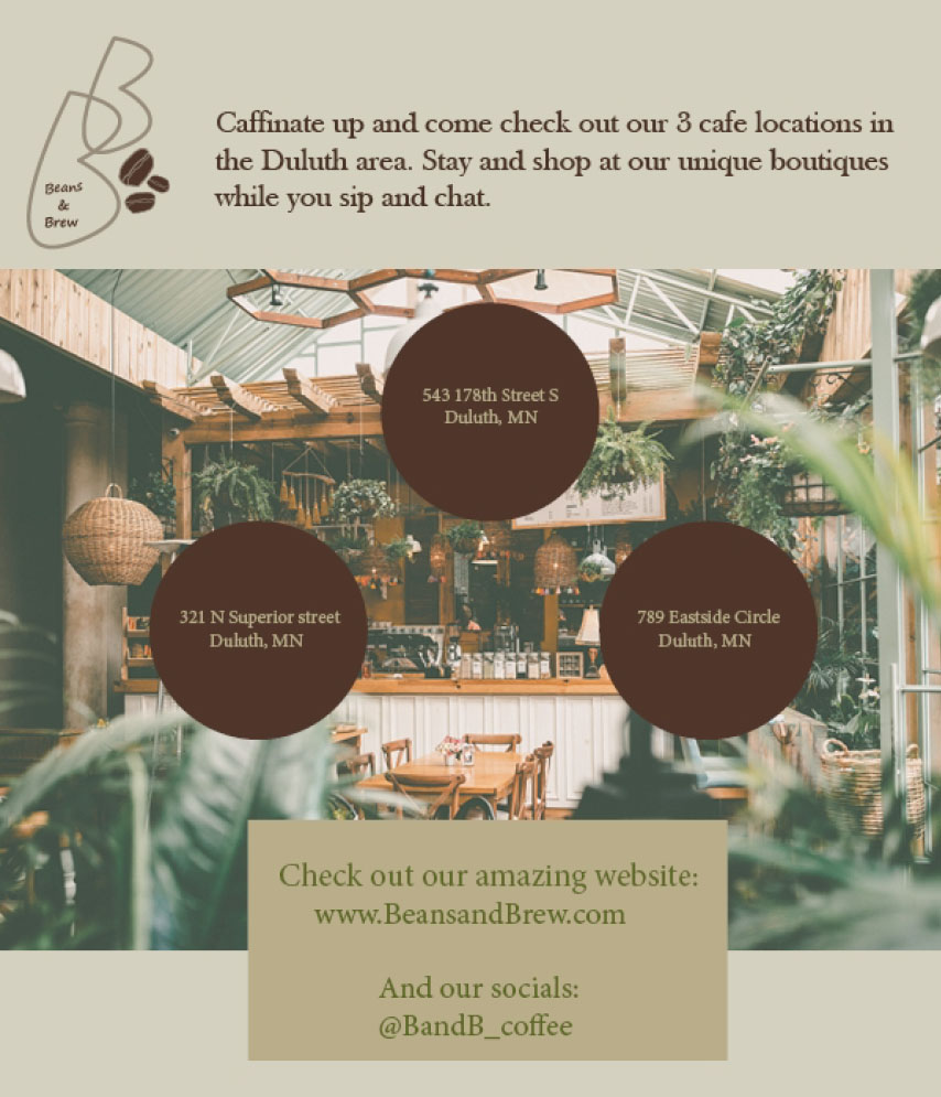
This project we had to come up with a magazine theme, think about the demographic and the design. I started out with coffee as my concept and picked out my colors for the mood board. I love the earthy and chill feel of coffee shops and so I went with the darker greens and browns and blues. This gives it a wholesome feel and gives it an even deeper feel of coffee.

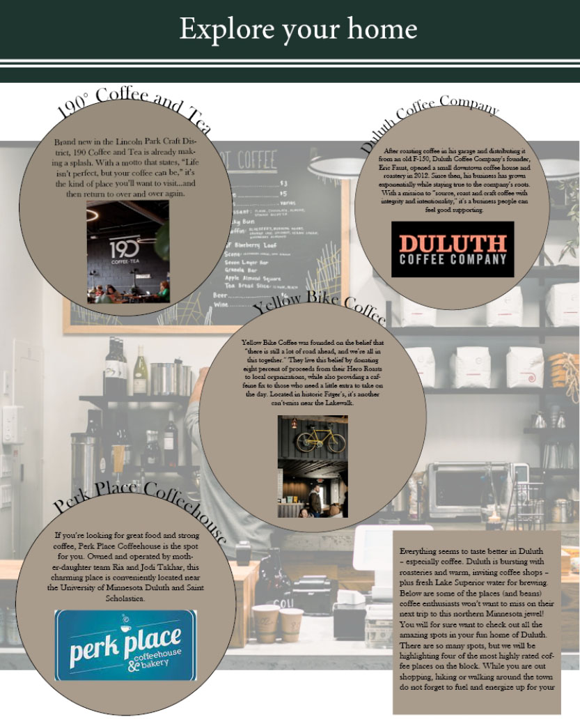
On each page I wanted to have the photos in the background correlate with the article. I wanted to display the type of the articles to be readable yet have interesting pictures that colorate to what is going on in the magazine. Readers love to have pictures to look at that catch their eye when they first flip the page.


I really enjoyed working on this project because it helped me work on my layout skills and how to format pages that are easy for readers to navigate through. What meshes together with images, font, size, text wrapping, branding, consistency, hierarchy. I created Beans and Brew in InDesign, which let me learn the app well.

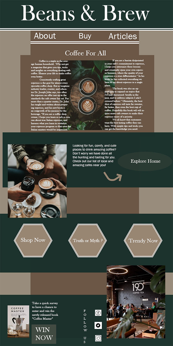
After making the magazine, we took our pages and created them in a way that would work well in an electronic newsletter format. I rearranged my front page to be more vertical and added buttons for navigation while still trying to keep the same theme and vibe as the paper copy of the magazine. This was an interesting task to keep it the same as the magazine yet change it for the online portion to fit the formatting for that.

